Temasek
Web
Mobile
Role
Product Design
User Research
UX/UI Design
Team
1 Product Manager
3 Front-end Engineers
1 Back-end Engineer
1 Product Designer (Me)
Timeline
2 months
Tools
Figma
Adobe XD
Overview
Winnow had the information. Users needed a clearer way in.
Investment teams use Winnow to research companies, conduct due diligence, and monitor their portfolios. It brings together company snapshots, internal knowledge, and easier access to tools like AI reports and due diligence, creating a more connected and visible experience.
As the product evolved, different investment teams had worked with Technology to build their own ways of accessing this information. Over time, the experience became increasingly fragmented.

Problem
Users were navigating the system, instead of the information.
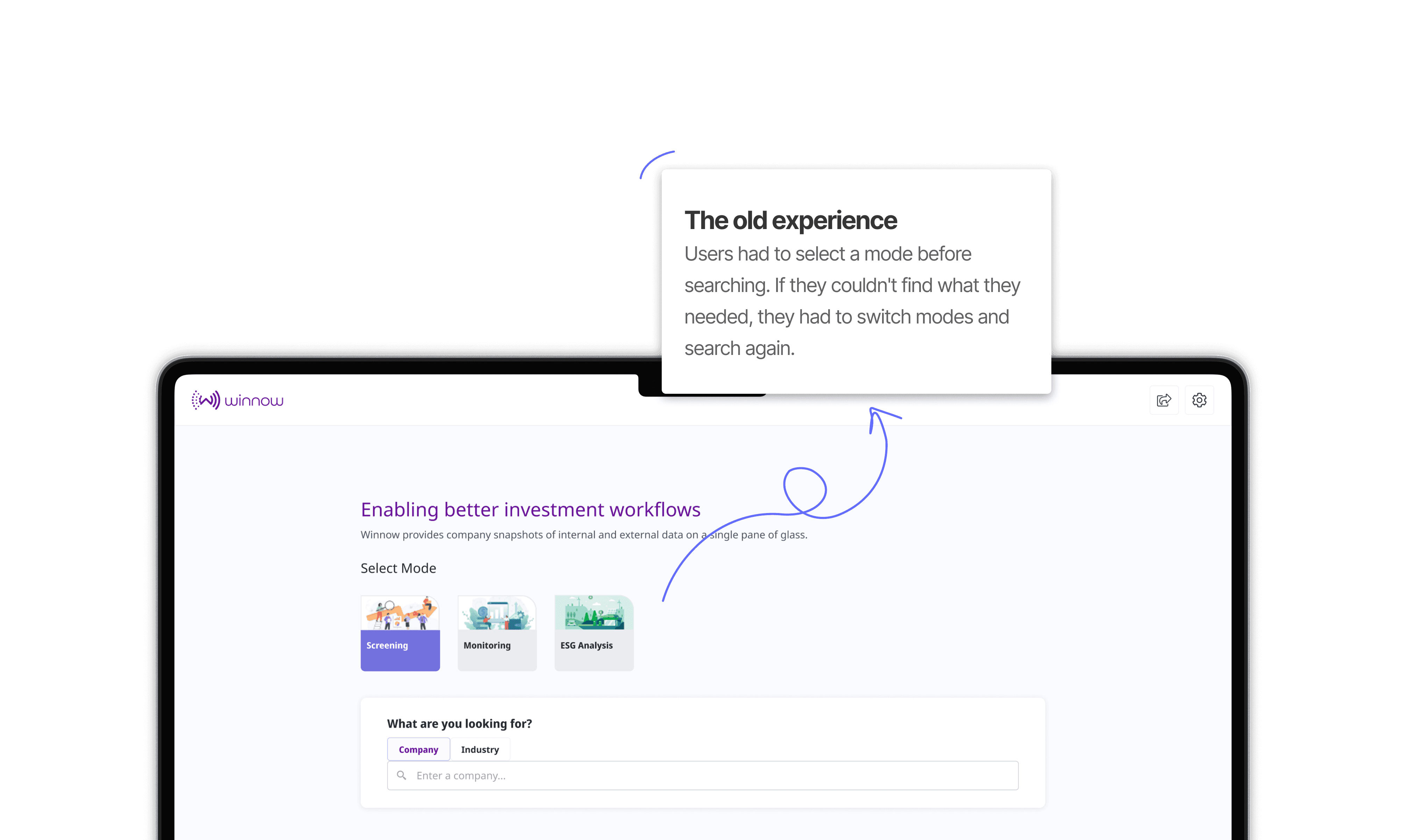
While the platform contained valuable information, users often needed to know exactly where to look to find it. The old experience required users to select a mode before searching for a company. If the information wasn't available there, they had to leave, switch modes, and search again. This made a fundamentally simple task, finding information about a company, unnecessarily difficult.
What I heard from users
Through conversations with multiple Winnow users, I found that people often didn't understand the full capabilities of the product. Features that could support their work were difficult to discover, while the underlying complexity of permissions and team structures shaped what users saw. This also contributed to lower-than-expected adoption.
The opportunity: Make the experience revolve around the company, rather than Winnow's internal team structure.
Design
Put the complexity behind the scenes
I redesigned the entire experience around a simple flow:
Search for a company → See the information available to you
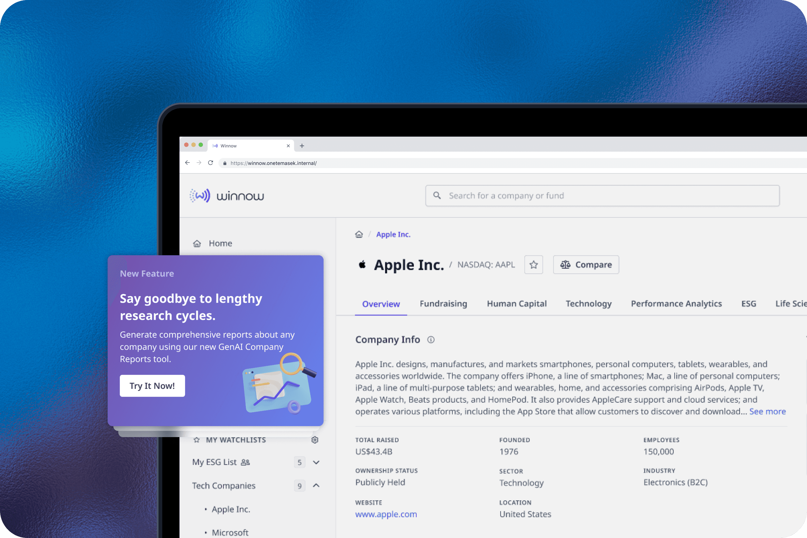
Research showed that users didn't always understand what Winnow could do. So rather than hiding functionality behind different modes, I surfaced relevant capabilities to make the product's existing value more visible. Users no longer needed to understand different modes. Access controls remained unchanged, while the system handled the complexity of determining what each user could see.


As part of the redesign, the team also introduced AI-powered company reports, allowing investment teams to quickly generate a brief overview of a company to support initial screening and research.

Outcome
More of Winnow became easier to discover
The redesign shipped and users found the new experience significantly easier to use. Previously underused features such as watchlists and portfolio monitoring saw increased adoption, while notifications helped users catch tasks they may otherwise have missed.
To support the transition, I also designed teasers and email communications, with a three-month period where users could switch back to the previous experience.
Reflection
Design around the user's mental model, not the system's
The biggest lesson from Winnow was that complexity doesn't always need to be removed. Sometimes it just needs to be moved behind the scenes. The redesign reinforced an important principle for me:
Design around what users are trying to accomplish, not how the organisation happens to be structured.


